Create Your Perfect World
Life Gets Busy
It is the same old story. Life gets busy and things fall by the wayside. With the end of the school year, teaching a summer program, finishing up the manuscript, and helping Dave move, I have not had much time lately. But I have started a relief painting, and wanted to share the beginnings of it. The idea grew out of the journal and could easily be adapted back into the journal.
Much of my work lately has been dealing with the layering of certain shapes and the sense of depth, overlapping, and transparencies. So I wanted to push this idea even further. By working with 22 in x 30 in heavy weight watercolor paper, I built up a very shallow relief by cutting shapes with a hobby knife and gluing the shapes down with gel medium. I then coated the whole thing with gel medium to create a consistent surface.
![](https://static1.squarespace.com/static/597136b0ff7c5064f2c70dc2/t/59765e91f951af665f10d0b6/1500929681665/1000w/)
Trying to work with acrylic paint in a similar way as I do with watercolor pencil, I then used cadmium yellow, yellow ochre, and burnt sienna to accentuate and highlight certain areas as well as to begin laying in the bigger patterns of dark and light. I blended the paint out with matte medium to create very transparent areas.
![](https://static1.squarespace.com/static/597136b0ff7c5064f2c70dc2/t/59765e91f951af665f10d0b8/1500929681665/1000w/)
Using burnt umber, crimson, and pthalo blue, I added more glazes of paint to bring in more contrast and to further develop the pattern of light and dark. I then used titanium white mixed with other colors to bring some highlights to certain areas, and used all the other colors to develop the forms within certain areas by mixing and blending.
![](https://static1.squarespace.com/static/597136b0ff7c5064f2c70dc2/t/59765e91f951af665f10d0ba/1500929681665/1000w/)
I've worked on it more since this last photo was taken, but the process has slowed down as I am beginning to tighten up and develop areas. I'll keep posting progress photos.
Much of my work lately has been dealing with the layering of certain shapes and the sense of depth, overlapping, and transparencies. So I wanted to push this idea even further. By working with 22 in x 30 in heavy weight watercolor paper, I built up a very shallow relief by cutting shapes with a hobby knife and gluing the shapes down with gel medium. I then coated the whole thing with gel medium to create a consistent surface.
Trying to work with acrylic paint in a similar way as I do with watercolor pencil, I then used cadmium yellow, yellow ochre, and burnt sienna to accentuate and highlight certain areas as well as to begin laying in the bigger patterns of dark and light. I blended the paint out with matte medium to create very transparent areas.
Using burnt umber, crimson, and pthalo blue, I added more glazes of paint to bring in more contrast and to further develop the pattern of light and dark. I then used titanium white mixed with other colors to bring some highlights to certain areas, and used all the other colors to develop the forms within certain areas by mixing and blending.
I've worked on it more since this last photo was taken, but the process has slowed down as I am beginning to tighten up and develop areas. I'll keep posting progress photos.
Journal Pages and News
Now, the news - the manuscript for our book is done, and has been sent off to the publisher. But not before a big scare. My computer crashed as I was finishing the final edits. I was just about finished, when my laptop froze. No big deal - a forced shut down would clear it up. But when I tried to turn it on - all I got was a flashing question mark. Hours and hours of trying everything and still nothing. Turned out to be a failed hard-drive. Luckily, in one of my all-too-rare moments of brilliance, I had all the book documents on an external hard drive. I only lost a few changes, and was able to finish up the edits the next day on the desktop. Other than losing all my data including photos and my iTunes library on the computer hard drive, it wasn't anything valuable. All the really valuable stuff is on the external hard drive and my two flash drives.
So, we have a title, a cover (the publisher has finalized a cover, and I'll share that as soon as I can), and a manuscript. I'll post updates regularly.
Connection
And that connection is with my wife. This past weekend we celebrated our wedding anniversary with a simple lunch and some book shopping, and I've been thinking a lot lately about her, our years together, and what she truly means to me. Without her, all of the wonderful things that have happened over the last few years would have been pretty meaningless, and I could have done none of it without her support. She has been there with me every step of the way and has always been my biggest champion even when it has meant my flying off to another conference or spending days and days away conducting workshops or working on the book.
The Journal Fodder Junkies could not be possible without her. So, this is just a little acknowledgment - a little thank you for the woman who has been there for me. I thank my wife Joanne for her patience, understanding, and love.
Collaborative Journal
The New and The News
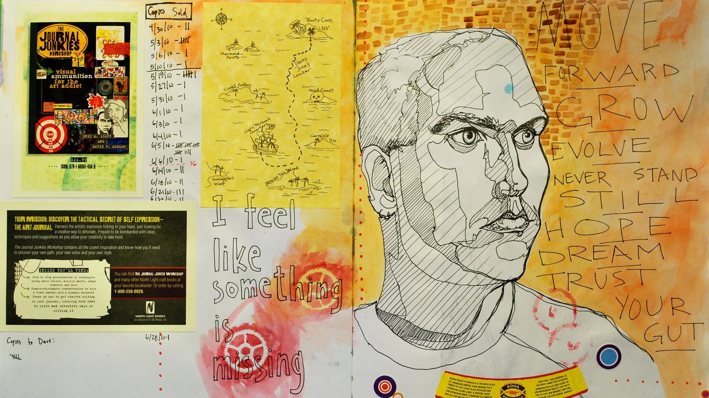
The New: So this is a new scan of Page 1 in Volume 12 of my journals. I began this page back in November, and I have slowly added to it. I began this page with watercolor and then drew the self-portrait from a photo that I took, and I've added watercolor pencil and ink. It is by no means finished, but I don't know if I'll go back to it much. I haven't worked much in my journal lately. I've been busy with so many things as well as just being plain worn out and exhausted. Perhaps with the school year wrapping up, I'll have more time soon.
The News: As mentioned, another school year is quickly coming to an end, and I am finishing my 13th year as a public school art teacher. I'm already looking forward to next year thinking about all the things that I'll do better and differently.
Our book finally has a title. Actually we have known about it for some time, but I just keep forgetting to post about it. But our book will be titled, The Journal Junkies Workshop: Visual Ammunition for the Art Addict, and will be released by North Light Books next year. We've actually have seen a design for the cover, and I'll share the finalized cover when I can. We are very excited about it.
And finally, Dave finished up his MFA in May, and has landed a teaching gig at Appalachian State University in Boone, NC where he will be teaching both Art Education and Studio Art courses. Congrats Dave.
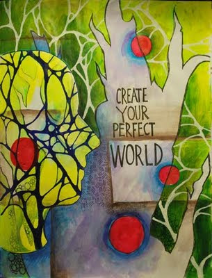
IF - Cracked
Although, I do not draw as much as I once did, and portraits really are rare in my art, I find myself returning to graphite now and then. I have turned away from portraits in favor of these abstract, shallow-spaced pieces. They have been much influenced by my mixed-media, layering work I have done in the journal.
These pieces rarely contain representational imagery, but can hardly be called non-objective. They really are representations of identity and experience. The way we experience a moment or an event is such a complex mental, physical, and emotional amalgam. Our experiences and our identities are such rich, multi-level entities that I have focused on this idea in much of my recent artwork. This particular piece explores how such a complex structure can be so very fragile and prone to cracking. So for all it's balance, rigidity, and structure, this piece is on the verge of complete disintegration as the cracks begin to show.
Journal Page
IF - Parade
But last week, I began flipping through them in an attempt to find some inspiration. I was immediately floored by their raw and prolific nature. I used primarily black ink and I sketched and worked fast, but I still manged to fill two or three per year. I didn't read the poetry, but I looked at page after page of doodles, sketches, and visual jottings. I was amazed to see some things - shapes, forms, and images that still reoccur in my art, but I was equally impressed with things that no longer occur in my art namely the figures. I've always loved figures and faces and people in general in art, but I've gotten away from the quick gestures that populate these little books.
So I decided to revisit them in a parade across two pages. I started with the black ink figures and then added the red-violet swirl. I then added watercolor pencil and finally watered down gesso. Despite begin grouped together, these figures are isolated from each other and do not interact. The gesso creates a fog and only bits through the rectangles are clear. It has a sombre feel, and it is most likely not finished and will evolve into something more.